Scenario
Big picture
You host a blog or website, and you need a dashboard to track various metrics. The dashboard will connect to Google Analytics or another database that updates the data on the dashboard.
Specifics
- You need to track visitors to your blog or website. You need to see these visitors over some period of time.
- You want to see total pageviews (a common website metric), total visitors and number of blog posts during the period.
- You want to see the blog posts or webpages that have the highest number of pageviews.
- You want to see visitors’ geographic location.
- You want to see the distribution of the visitors by weekday.
Related scenarios
- You are a publisher tracking book sales, the number of books sold, the top books being sold and the locations of the sales.
- You need to track customer acquisitions for various product lines, showing total acquisitions over time and the top product line categories.
- You need to track subscribers to your service.
- You need to track something over time, on an aggregated basis, showing the top n and the geographic location.
How people use the dashboard
The user will review this dashboard at some regular interval, such as monthly, quarterly or as needed on demand. The dashboard gives an overview of the key statistics that the user tracks. In the field of website analytics, pageviews is a common metric. This is the number of times a web page is viewed. The dashboard shows pageviews in a number of ways as well as a few additional metrics.
At the top of the dashboard in Figure 1.1, three high-level metrics are shown: the total pageviews for the time period, which is noted at the top of the dashboard, the total number of visitors and the number of blog posts. A bar chart shows the daily pageviews over time along with a trend line to help visualise the trend for that period. A histogram is used to show the pageviews by the day of week.
 The histogram in Figure 1.2 does not have an axis label or data labels. It’s used in a similar manner as a sparkbar, simply to visualise the overall distribution for the days of the week. Data labels could easily be added, but in this case there is no need to see that one day is 31,966 compared to another day. Also, there are tool tips built in, so users can hover over any point, including the histogram, and see the data if they choose to (see Figure 1.2.) The big takeaway: There are far more pageviews during the workweek, with Tuesdays and Thursdays getting the most views.

Why this works
Complete data, not aggregated data
A lot of the dashboards in this book focus on key performance indicators and aggregated metrics. This is good when looking at the higher levels of a business, but consider what the data in healthcare is all about: each record is a patient, a patient who might be struggling. Working out the average symptoms for all patients might provide a picture for those governing the healthcare provider, but the overall average is of no use to the provider trying to help an individual patient. Each patient is different, and each needs individualised plans.
This doesn’t mean a single dashboard view is needed for every single patient. Instead, this dashboard provides a holistic view of the history of all the patients under the care of the team. With one screen all the patients’ details can been seen and discussed.
 Stories about real people told linearly
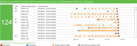
These are real patients. Their stories cannot be aggregated into averages. Looking after their health requires being able to see the complete narrative, which this dot plot enables. The dot plot in Figure 2.1 showing each interaction along a horizontal line makes it easy to follow this history visually.
 Single-number callouts
How many new patients were admitted in the last 24 hours? How many patients who have been admitted in the last 30 days are still in the hospital? Both of these questions are important to answer. The answers are the biggest and most obvious features of the dashboard, as seen in Figure 2.2. The answers are 14 and 124, respectively, shown in large numbers on the left-hand side of each section’s dot plot.
Filters at the top
This single dashboard is used by multiple teams, so they need filters to get to the right data quickly. Therefore, for this dashboard the filters are at the top, where people are most likely to look first (see Figure 2.3). In an ideal situation, the filters should be retained so that each time the viewer opens the dashboard, the filters are already set. If that’s the case, and the filters no longer need to be reset on each view, it would be possible to move them to a less prominent position, such as the right-hand side.
This is an edited extract from The Big Book of Dashboards: Visualizing Your Data Using Real-World Business Scenarios, by Steve Wexler, Jeffrey Shaffer and Andy Cotgreave (published by Wiley, 2017)


